You saved forty photos of centerpieces, thirty of bridesmaid dresses, and a dozen invitation suites, and somehow none of them use the same shade of green. That’s the most common way wedding colors go sideways: not from picking a bad color, but from picking several good ones that were never meant to sit next to each other.
Choosing wedding colors that actually work together is less about taste and more about method. This piece covers how to start from a mood instead of a mood board, a simple ratio that keeps any palette from feeling chaotic, the color trends worth knowing about in 2026, and where your choices need to show up consistently across the day. If you’re earlier in the process than that, the full wedding planning guide covers where color fits into the bigger timeline.
Start with a mood, not a Pinterest board
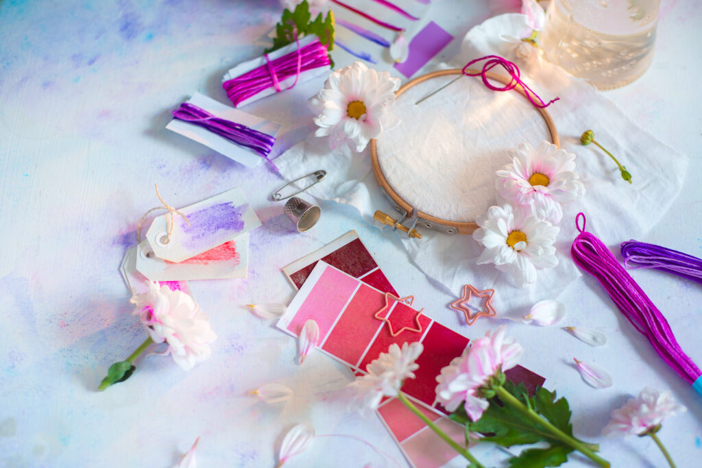
Before you pick a single shade, decide on three words that describe how you want the day to feel: romantic, bold, relaxed, formal. Pinterest boards tend to mix aesthetics that contradict each other, a moody, candlelit palette next to a bright, garden-party one, because both looked good in isolation. Neither is wrong, but they can’t both be your wedding.
Once you know the mood, colors get easier to filter. A romantic, soft mood points toward blush, sage, and cream. A bold, modern mood points toward jewel tones or a single saturated color against a neutral base. This is how to choose wedding colors without getting stuck cycling through hundreds of options that all technically qualify as “pretty.”
The 60-30-10 rule for a palette that doesn’t fight itself
Interior designers use a ratio to keep a room’s colors balanced, and it works just as well for a wedding color scheme: 60 percent a dominant neutral or base tone, 30 percent a secondary color, and 10 percent an accent used sparingly.
In practice, that might mean 60 percent ivory and cream (linens, invitations, the dress), 30 percent sage green (bridesmaid dresses, greenery-heavy florals), and 10 percent a deeper accent like terracotta or burgundy (ribbon, a groom’s tie, accent candles). Wedding color schemes built this way tend to photograph better because nothing is competing for attention, the accent color gets to actually read as an accent instead of getting lost among four other colors trying to do the same job.
Wedding color trends worth knowing about in 2026
Pantone named Cloud Dancer, a soft, warm white, as its 2026 color of the year, and it’s shown up across a lot of 2026 wedding palettes as a base neutral instead of stark white. Butter yellow has emerged as the season’s more emotional, personality-driven color, often paired with warm neutrals rather than cool ones. Sage and other muted greens have held on as a dependable, easy-to-pair option, while cobalt blue paired boldly with chartreuse or a bright fuchsia accent is showing up for couples who want a bolder look for a summer wedding instead of a safe, pastel default.
| Season | Popular palette | Why it works |
| Spring | Cloud dancer white, butter yellow, sage green | Soft and warm without leaning saccharine, pairs easily with garden-style florals |
| Summer | Bold jewel tones, cobalt with chartreuse or fuchsia accents | Holds up in bright daylight and reads as intentional rather than washed out in photos |
| Fall | Rust, burgundy, deep brown neutrals | Matches the season’s natural palette, photographs warm under evening light |
| Winter | Deep green, cream, metallic accents | Reads formal and cozy at once, metallics catch candlelight well |
Where your colors actually show up on the day
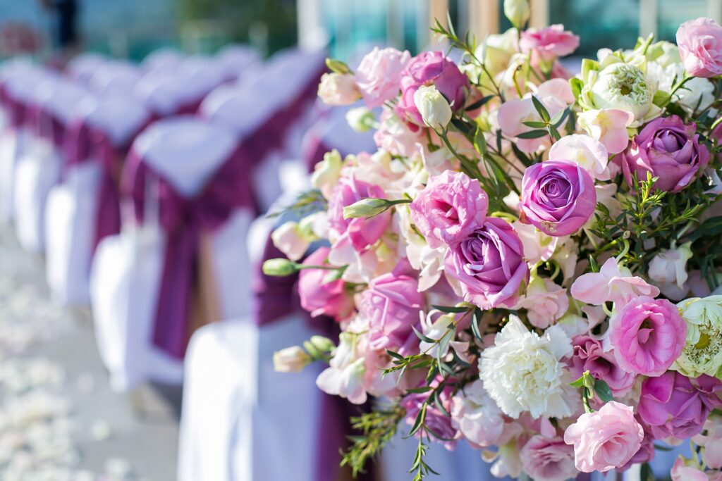
A wedding color scheme only works if it’s consistent across every part of the day guests actually see, not just the parts you photographed for inspiration.
- Wedding party attire: bridesmaid and groomsmen colors are usually the biggest visual block of color in your photos, so they should anchor the palette rather than get chosen separately from it.
- Florals and greenery: flowers don’t need to match your colors exactly, but they should sit in the same family. A sage palette with hot pink florals will fight itself in every photo.
- Linens and tableware: this is where couples most often forget to apply the palette, defaulting to plain white out of habit even when the rest of the day uses a warmer base tone.
- Invitations and paper goods: the first thing guests see should set expectations for the palette that follows, so matching your invitation suite to your actual colors (not just a similar aesthetic) keeps the whole day feeling cohesive from the start.
Common wedding color mistakes couples make
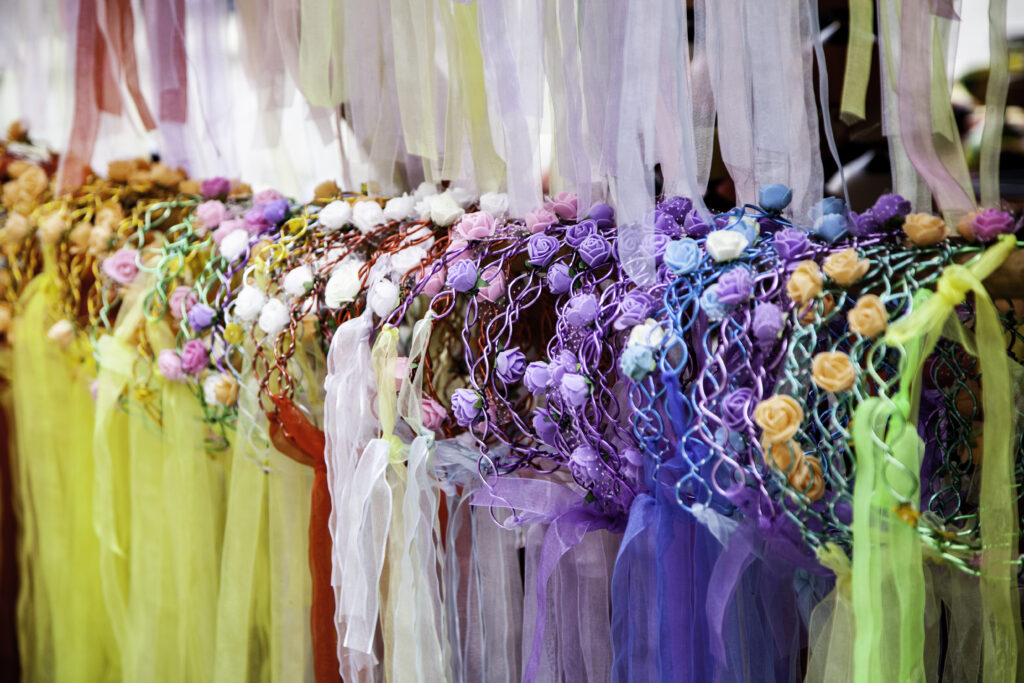
- Picking too many colors: three colors, in the 60-30-10 ratio above, is almost always enough. A palette with five or six competing colors usually happened because the couple never picked a dominant one.
- Matching flowers exactly instead of complementing them: real flowers rarely come in the exact shade of a swatch. Aim for the same color family instead of an exact match, and let the florist’s expertise fill the gap.
- Ignoring the venue’s existing colors: a venue with warm wood tones and brass fixtures will clash with an icy, cool-toned palette no matter how well the swatches look on paper. Walk the space, or look closely at photos of it, before finalizing anything.
- Choosing colors that don’t hold up in your actual lighting: a palette that looks perfect in daylight can wash out completely under a reception’s warm, low lighting. Ask your florist or planner how your colors read under evening light before committing.
Your palette is a filter, not a finish line
The point of choosing wedding colors isn’t to lock in a swatch and never think about it again, it’s to give yourself a filter that makes every other decision faster. Once you know your palette, choosing linens, florals, and even your invitation suite stops being an open-ended search and becomes a much shorter list of things that actually fit.
If you’re still narrowing down where the wedding itself will happen, matching your palette instincts to your venue’s existing style is worth doing before either decision is fully locked in. The two inform each other more than most couples expect going in.
One more thing worth planning for
Your color palette will photograph beautifully. But the parts of the wedding people talk about years later rarely have anything to do with the swatches, they’re about who was there and what they said. The Toast turns your guests’ messages and toasts into a professionally edited video keepsake, a detail that has nothing to do with your palette and everything to do with how the day actually felt.
FAQs about wedding color schemes
How many colors should a wedding color scheme have?
Most wedding color schemes work best with three colors: one dominant, one secondary, and one accent used sparingly, following a roughly 60-30-10 ratio. More than three tends to look chaotic unless one color is clearly leading.
What is the 2026 Pantone color of the year and how does it work for weddings?
Pantone named Cloud Dancer, a soft warm white, as its 2026 color of the year. It works well as a base neutral for a wedding palette in place of stark white, especially paired with warmer accent colors like butter yellow or sage green.
Do my wedding flowers need to match my color scheme exactly?
No, and trying to match exactly usually backfires since real flowers rarely come in the precise shade of a swatch. Aim for the same color family and let your florist choose specific blooms that read well together in that range.
How do I choose wedding colors that work for both an indoor and outdoor part of the day?
Test your palette under different lighting before committing, since warm indoor lighting and bright outdoor daylight can make the same color read very differently. Muted, warm-toned palettes tend to hold up more consistently across both settings than very cool or pastel ones.
What wedding colors are trending in 2026?
Cloud dancer white, butter yellow, and sage green are leading softer, warmer palettes this year, while bolder couples are pairing cobalt blue with chartreuse or fuchsia accents. Rust and deep brown neutrals are also trending for fall weddings specifically.